
The Central division is rife with fodder for me to mock, so in the spirit of my last post I will show no mercy.
Chicago Blackhawks
 You know what I think of when Chicago comes to mind? Native Americans. Okay, not really. Ask ten people what comes to mind when they hear Chicago and their answers will range from "deep dish pizza" to "Sears Tower" to "The Cubs". I'll bet nary a one says "The Blackhawk Tribe." That aside, a pat on the back for avoiding the cartoonish depiction that Cleveland uses, but hey, it's Cleveland. It also appears that the mascot is wearing the NBC peacock in his hair, which is ironic since the Blackhawks didn't televise games for what seemed like a century. The Blackhawks mascot is named "Tommy Hawk" which is all too appropriate considering the town's violent background. Nothing draws Chicago fans like the threat of violence!
Columbus Blue Jackets
 Pretty surprising they would select a team name with the word "Blue" in it considering they're in the same division as the St. Louis Blues. So, what comes to mind when you hear "Blue Jackets"? Is it a sale at JC Penney? Is it a rare variety of bee? Nope, it's a Civil War soldier! Did anyone tell these guys to avoid the abbreviation "B.J."? Between the NBC peacock in the Blackhawks logo and the shooting star in Columbus' you have a "The More You Know" PSA.
Detroit Red Wings

On the opposite end of the spectrum from Atlanta, Detroit decided they needed just two colors because they weren't boring enough. Can someone explain this winged-wheel to me. Does it fly? Is it supposed to roll? Do the wings flap against the road as it wobbles around? Is it attached to anything or is it just some kind of lame Transformer? Or maybe it's an angelic unicycle? I mean, isn't the point of the auto industry that it rolls and doesn't fly?
Nashville Predators

There are a lot of animals that could be considered predators, but Nashville was bold and went with one that had incredibly impractical biting apparatus. Dinosaur? No. Jungle cat? Closer. Extinct cat with a severe overbite? Bingo! Pat on the back for ditching the third jersey with the logo that looked like it had a hairball caught in its throat. However, making silver a prominent color just makes us think you're a second place kind of team.
St. Louis Blues
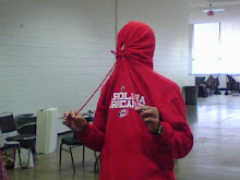
 I mean, you're really setting yourself up for failure when your team is named after the official music of the depressed. It must be a thing in the Central Division to add wings to an obscure inanimate object. When I say your logo is a low C, I'm not speaking in musical terms. As a bonus, here is the Blues mascot Louie pictured with former Blues netminder Manny Legace:
I hope you enjoyed this segment of Jersey Destruction. Tune in next time as we head back east!
No comments:
Post a Comment